
Teaching with graphic novels is new for me. While I have several sets of various titles, I’ve decided to only have one of my reading groups choose a graphic novel so far. I wanted time to learn from my students and improve my instruction to benefit the rest of my student groups. In other words, they are my guinea pigs. You should have seen their excitement when I showed them the graphic novel choices for our reading. They were surprised that we would get to spend our time together discussing and analyzing a graphic novel.
Pre-Teaching Concepts
Before starting with our graphic novel, Smile by Raina Telgemeier, I used a series of books to preteach important visual literacy concepts. Some of the books, like Level Up by Gene Leun Yang are graphic novels, while other books like Hippo! No, Rhino! by Jeff Newman, and The Invention of Hugo Cabret by Brian Selznick, are picture books with limited text. Rather than showing students different examples of visual concepts, we took time to look through each book together so that students could construct their own ideas.

We discussed this key question during our lesson: How do authors of graphic novels express their ideas? After some discussion, here is what we learned:
Authors use perspective and size to show important details or different characters’ views.

Body language and facial expressions show a character’s feelings.

Font, text color, and size can help the reader know how words are said.

Shading and color can be used to draw attention to important parts of the pictures.

Application
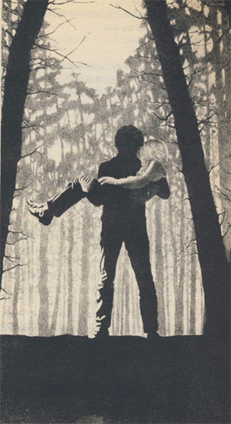
I had taught the above lesson in preparation for beginning our graphic novel. It happend to take place a few days before my group finished reading Bridge to Terabithia. As we were having our final book club discussion, one of my students drew our attention to an illustration toward the end of the story. Here is what our conversation sounded like:
S1: I want to talk about this picture. It reminded me of what we learned about graphic novels, even though it’s a regular book.
Me: What do you think this picture is showing us?
S2: Well, it’s all black and white. It’s kind of like that Hugo picture where the illustrator made one character stick out using light colors. Jess sticks out here too because of light colors.
S3: Why is his dad in shadow, though?
Me: That’s a good question. Does anyone have an idea why the illustrator did that?
S1: Maybe to make the character stand out. It also shows us the difference between the dad and the boy. The dad is in shadow, but he is bigger and stronger. The boy looks weak.
Me: That’s interesting. Do you guys think the story supports those thoughts?
S4: Yeah, because the dad helped the boy when he was crying because his friend died. The dad kinda didn’t care about his son too much earlier in the book, but here he is strong for him.
Goosebumps. I had goosebumps! This was the start of my student-led discussion after ONE lesson on visual literacy concepts. They were discussing symbolism that was supported by the text. I’ve usually had trouble introducing the concept of symbolism with my students in past years because it is so abstract, but these kiddos jumped right in because the illustration was approachable. It didn’t intimidate them like regular text might. We went on to discuss the sunlit background vs. the darker foreground and what that might mean.
I think we are off to a strong start, and I can’t wait to see how this group does as they apply these concepts to our first graphic novel.
No comments:
Post a Comment